|
Having grown up in London, the UK capital has been a great source for photographic locations and inspiration since I started photography. Over the years, I've had several day trips up to the city to explore new areas and buildings with photography friends. This story is the second part of a series looking back through my archives to some of my favourite shots from the city I grew up in. To see some of my earlier photos from London, check out part one of the series here. |
|
|
|
|
|
QUEEN ELIZABETH OLYMPIC PARK |
|
|
|
|
The first location we're heading to is the Queen Elizabeth Olympic Park. Built for the London 2012 Olympics, the park is part of the Olympics legacy and is home to the London Stadium, London Aquatics Centre and the London Velodrome. The day my friends and I visited was a crisp cold late-December morning with a brilliant blue sky, which provided a nice backdrop to the buildings. |
|
|
|
|
The main highlight of the park was the London Aquatics Centre, the home of swimming and diving during the 2012 Olympics. Designed by the late Zaha Hadid, the building is inspired by the fluid geometries of water in motion. The first two images from this building are taken along the side of the facade, where the wave-like roof's timber anchors into the ground. In the first, I enjoyed the curvature of the timber as it heads towards the ground and the revelation of the blue glass in the corner of the frame. In the second shot, I liked how the use of similar timber on the bench ties the uniquely designed seat and building together. |
|
|
|
|
During editing, I wanted to ensure that all of my photos from the building were consistently edited. The main part of the building which was especially hard to edit was the roof as it would have a different hue depending on the lighting conditions at the time. In the photos above, I masked over the wooden facade and reduced the hue of the blue shadows that were present. This caused the wooden panels to appear greyer, which is more consistent with the colour in real life. In the first image, I also brought up the blue levels to make the glass pop in the image! |
|
|
|
|
Continuing to walk around the side of the building provided an excellent "look-up" view of blue side glass and curved roof. The timber roof arches over like a wave that sweeps upwards towards the sky and from afar it can look like a sea ray swimming through the air. I love how the minimalism of this shot is split in two by the contrasting roof that dissects the frame. Also, this view displays the stunning subtle asymmetrical nature of the building's architecture. |
|
|
|
|
As with the previous photos, the editing was mainly focused on matching the colours in the image to the overall set. I started by tracing over and replacing the sky, ensuring that I added a slight gradient and noise to make it all more realistic. Then I masked over the wooden roof to apply the same treatment of reducing the blue hues caused by shade. |
|
|
|
|
We continued to walk around the building and headed to the main attraction, the interior of the centre. Inside, the scale of the building becomes apparent and unfortunately, the photos do not do it justice. Above the Olympic-sized pool lies the floating roof which seamlessly flows from the outside via a wall of glass. I started by taking a panorama shot which I would later stitch together in post-editing. However, a friend let me borrow his 11-16mm wide-angle lens which I quickly put to good use to retake the photo! In the end, spending the day using this lens eventually persuaded me to get one myself, becoming my go-to lens since. |
|
|
|
|
Back at the computer, this photo became the first photo that took me multiple days to edit. I applied my usual perspective corrections and lens adjustments before I started my main edits. The main parts of the photo I wanted to improve were the floor-to-ceiling glass behind each stand, which are covered in a deep blue covering for privacy. In Photoshop, I slowly masked over each glass pane and replaced the sky to a brighter, more natural colour. To help save some time, I copied the windows from the left of the frame to replace the windows on the right. I ended up needing to mask over most of the image to remove the blue hue that the windows cast across the indoor space. To match the exterior, I reduced the hue and brightness of the roof, making sure to keep some colour in recessed lights. At the end of editing, the photo became one of my favourite shots of the trip and even ended up being one of my most liked photos of the year! |
|
|
|
|
We then began to explore the space more, heading up towards the smaller diving pool in the far end. I decided to head down into the stands and came across this nice view of the diving pool and opposite stands. I especially like how from this angle, you can see the wave-like shape of the roof that arches over the two pools. In retrospect, if I were to retake this photo, I would move over to the right-hand side more so that the end of the pool is centred in the frame. |
|
|
|
|
To be uniform, I edited this shot in the same way as the photo above. I masked over the blue windows again to replace the sky and whilst I was masking out the interior to remove the blue hues, I made sure that I left colour in the blue diving boards. |
|
|
|
|
We decided to head back outside (ok, maybe we were asked to leave by security for hanging around too long) and headed to the velodrome whilst exploring other areas of the 520-acre park. Along the way, I noticed the unique integrated wind-turbines and floodlights that surrounded the London stadium. Standing at 18m tall, the structures form part of the sustainability pledges made during the building of the London 2012 park. As it was a bright sunny day, I enjoyed the stark contrast between the bright minimalist design of the floodlights and the crisp blue sky. |
|
|
|
|
Back at home, I cropped both photos to their final form and applied some Lightroom adjustments, which included brightening the highlights on the poles to increase their contrast against the sky. In Photoshop, I masked around the structures to replace the sky to match the full set of photos from the day. I also took the opportunity to remove any traces of colour in the two masts by reducing the hue levels on the original image layer. |
|
|
|
|
Eventually, we turned up at the London Velodrome to find that it was closed due to a private event. We still made use of the time by exploring the areas surrounding the venue. Designed by Hopkins Architects, the exterior facade reflects the geometry and materials used in the 250m indoor cycling track, whilst also drawing similarities to the Aquatics Centre on the opposite side of the park. I decided to mimic one of the photos of the Aquatics Centre and lined up my camera so that the widest section of the roof lined up in the centre of the frame. |
|
|
|
|
When I got to my computer, I began by trying to apply perspective corrections, which turned out to be quite a difficult task. I eventually ended up having to crop into a section of the photo which allowed the perspective corrections to line up perfectly. Next up, I fired up Photoshop and began working to replace the sky, again to have a uniform look across my photos from the day. I also took the opportunity to modify the tint of the roof to bring out the deeper orange hues. In the end, the photo didn't need much editing as the scene was already nice and minimal. |
|
|
|
|
That wraps up the collection of photos from the Queen Elizabeth Olympic Park. Overall, I thoroughly enjoyed our crisp winter's morning exploration of the park and some of the photos I took are still among my collection of favourite shots of all time! |
|
|
|
|
|
EXPLORING SOUTH KENSINGTON |
|
|
|
|
The next stop on our tour of London is at the South Kensington Leisure centre, which I visited on a day trip in early December 2017. My friends and I had started the day exploring the Portobello market before deciding to wander away to explore some of the side streets. During this walk, we came across a leisure centre which had a modern design that made itself stick out from the surrounding residential neighbourhood. |
|
|
|
|
The upper facade drew me to this building, as I love how the use of glass reflects the blue hues from above whilst the bright white sun-breakers draw your eyes up to the sky. I took my first shot looking up at the curved corner of the street as I liked how the curve contrasted with the otherwise angular design of the building and facade. |
|
|
|
|
As I had a few photos from this location that were all taken with the same settings and conditions, I wanted to make sure that they all formed a uniform set. I selected the photos to edit and turned on Lightroom's 'Auto Sync' feature and started applying my usual colour-grading, such as exposure and white balance. However, these photos didn't require much post-processing due to near-perfect conditions in person. |
|
|
|
|
Heading around the corner, I liked how the right-hand facade continued over the entrance hall and how the two sections of the building intersected at an angle. As this was before I had a wide-angle, I ended up taking a series of 6 photos to ensure that I captured the scene from the pavement to the sky. |
|
|
|
|
Each of the individual photos had already been edited whilst I was processing the previous photo, so all I needed to do stitch the photos together. I fired up Microsoft Image Composite Editor and loaded the images in and let the application do its magic. Unfortunately, it had some issues trying to line up the vertical lines on the facade, so I had some extra time fixing the mistakes in Photoshop. After this, I applied my final perspective corrections and crop in Lightroom, making the photo ready to export. |
|
|
|
|
Many of my trips to London often result in time spent wandering around catching up with friends, so not many photos typically end up being taken on them. This section contains those rare photos that don't really have anything in common with each other, other than being taken on various trips to London. |
|
|
|
|
The first two images were taken during a day spent wandering around Canary Wharf. Unusually for London, the deep summers' deep blue skies were out in full and causing the skyscrapers to have a nice contrast between the reflecting glass and bright cladding. The Ernst & Young tower was a perfect example of this, due to its glass-clad corner cut-off reflecting a pleasant vivid blue, and even became a fan favourite on my website where it ranked as the second most viewed photo of 2019. |
|
|
|
|
When I first imported the image into Lightroom, I wasn't a massive fan of the shot. It took quite a while of me playing with the crop and perspectives before I finally came to a composition that I thought worked with the design of the building. To bring out the aspects of that day that I liked in the photo, I increased the vibrancy and saturation of the blue hues, as well as colour-grading the image so the cladding was a bright white to contrast with the glass. To add a pop of colour, I increased the saturation on the yellow EY logo, which I think provides some balance from the overall blue image. |
|
|
|
|
The yellow colour pop links to the second image from that day, which was taken only a few meters from the first. Back at ground level, we came across a bright yellow wet floor sign which was "peeking" out from the entrance. With the clouds and surrounding buildings producing a soft light over the scene, I admired how simple and monotone the photo ended up looking, with only the vertical lines of the fins adding a subtle pattern. |
|
|
|
|
Next up for my random London locations is Nova Victoria. For months, whenever I visited Victoria to catch a coach or visit friends, I would always see this complex and want to get my camera out and explore, but either the time or weather was never on my side. On one trip, I finally decided to explore the area and got my camera out to capture the nice modern facade with a splash of vibrant red. |
|
|
|
|
For both photos, I quickly applied perspective corrections and cropping before I edited both shots together using Lightroom's auto-sync feature to give both photos a similar look and feel. I used the facade to set the white balance on the images and applied my usual colour grading steps, like boosting the exposure and shadows whilst reducing the black point of the image. As the red facade drew me to the building in the first place, I increased the vibrancy and saturation of the red to make it pop out in the image, whilst increasing the teal saturation in the glass to complement the dark red. |
|
|
|
|
The next set of 3 images comes from a day exploring Fitzrovia and Russell Square with some uni friends. The first features Adam (@adam_pietraszewski) ascending the stairs of the brutalist UCL Centre for Languages. Just beforehand, we had stopped by a florist so Adam could grab some props for an upcoming photoshoot, and I thought that having him and the leaves might make an interesting subject to contrast with the concrete material of the structure. After many attempts walking up and down the stairs, as well as waiting for other people to cross the frame, I took a photo that I was happy with. |
|
|
|
|
When I got home I realised I had made a mistake. The shots I had taken were slightly out of focus, enough that it was noticeable when viewed at a distance. I came up with a plan to try to rescue the shot - cut out Adam and add him to an earlier, in focus, shot I took of the stairs. I began by editing both photos with perspective corrections before giving them both the same colour-grading. For the image with Adam, I applied heavy sharpening and noise to attempt to make him look less out of focus. Taking the images into Photoshop, I masked around Adam and blended him onto the background image. Overall, I think that the result is quite good at repairing the error that I made, and only on closer or extended examination can you tell that there was something wrong. |
|
|
|
|
Continuing to explore the area, we came across the modernist architecture that forms The Brunswick, a grade-II listed residential and shopping complex. In a similar style to the UCL building, the structure was constructed using concrete and designed in a tiered arrangement, allowing each residential flat to have a balcony and some sun. At several intervals along the structure were flats with glass-house like rooms extending over their balconies, and I thought the nice blue hue of the glass contrasted with the bright cream of the painted concrete. |
|
|
|
|
The last location in this section is Centre Point Tower. As I was exploring the city whilst waiting for friends, I came across this section of the facade which I instantly fell in love with due to the deep teal glass colour and the interesting geometry of the brick-clad supporting wall. I decided that this section would end up providing a nice backdrop for "person walking" shot, so I set up across the road and waited for the right opportunity to happen. It ended up that between myself and the building was a junction stop line, so many cars would end up blocking the view for minutes at a time. After around an hour of waiting, and many attempts to get a nice shot, I saw this person begin to walk into frame and I instantly knew it was the shot I was after. |
|
|
|
|
Back at home, I didn't need to do much editing to create the photo I envisioned on the day. After making basic colour-grading and perspective corrections, I boosted the saturation of the teal glass as well as the blue outfit. Taking a quick trip into Photoshop, I removed a car that was sneaking into the frame in the bottom left corner and removed some litter and marks on the pavement to clean up the image. |
|
|
|
|
The final London trip to make it into this story is from a time when I was waiting to meet some friends on a cold winter's day. To keep myself entertained, I decided to head into the British Museum to have an explore of the stunning Queen Elizabeth II Great Court. The modern, minimal court and glass roof (which contains over 3,100 unique panes of glass) perfectly contrasts with the old Greek-style exterior of the court. The first of the triplicate comes from the second-floor balcony that overlooks the main entrance to the museum. |
|
|
|
|
Now, this is definitely one of "those shots" that everyone takes. But from the outset, I had a plan to make my own spin on the classic shot by removing almost all people from the photo. As I was inside and on private property, I was unable to set up my tripod and take a nice long exposure. I ended up attempting two different techniques to try to get the look I wanted; the first was taking a burst of images, and the second was a longer shutter speed of 0.5s. To reduce movement in both of these techniques, I held my camera onto the railing and pressed my camera down to attempt to stabilise it. |
|
|
|
|
Before I began undertaking the editing process, I needed to select the base image that would be the main template for the shot. Unfortunately, the stacked images were slightly out of focus and I didn't end up taking enough photos to successfully remove the majority of people. The shot I ended up using (hover over above to see!) was one of the 0.5s exposures as the image was clear enough but still had some aspects of movement within the frame, which I wanted to keep some of in the final image. |
|
|
|
|
In Lightroom, I applied my usual perspective corrections before starting my colour-grading, which included brightening the whites and altering the hue of the roof structure. I then fired up Photoshop and began working on erasing the people. I mainly used the clone stamp tool to slowly remove each group of people from the frame, whilst compositing some areas from the other images I took of that day. In the end, I brightened the white central portion of the photo further to clean the image slightly and added back the two groups of people to bring a sense of life into the shot. |
|
|
|
|
Looking back, I am pleased with how this image turned out, especially as it was my first major photoshop project, and it even became my favourite shot from last year. The editing process also helped me massively improve my skills, some of which I would use again for a similar project from my trip to New York (story coming soon!). |
|
|
|
|
Next up, I repositioned myself to set up for the next photo. As I liked how the stairs draw the eyes up to the roof, I shifted over slightly to only focus on just one half of the court. |
|
|
|
|
I used the same technique whilst editing this photo that I did with the previous shot, although I had to use different images for the base and compositional layers. Again, I chose to keep an element of life within the photo, so I decided to keep the man in red by the visitor map as his jacket happened to match the design of the sign. |
|
|
|
|
The last shot was taken at an opportune moment as I was wandering around the court. I saw a tourist sit on the bottom of the empty central staircase so that only her legs were in view. I quickly rushed over and took this photo moments before she stood up and left. |
|
|
|
|
There wasn't much editing that I needed to undertake on this image to get it to where I wanted. The main adjustments I made were perspective corrections to line up the vertical lines and overall brightness adjustments, although I wanted to have the stone slightly darker than the previous images to preserve its tan colour. Overall, I'm extremely happy with how the photos from this location turned out, especially as it was the first time I'd tried to remove so many people from one image! |
|
|
|
|
That brings us to the end of my London explorations for now. Keep an eye out for some upcoming stories where I explore the photos I took on a recent trip to New York as well as ones I've taken from around my university city! Also, let me know in the comments below if you have any suggestions for any areas I could explore in London! |
|
|
|
| | | | | |
 | |
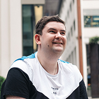
| BY ALEXANDER WRIGHT |
| Alexander Wright is a London and Southampton based photographer focusing on architectural and minimalist photography. In his spare time, he enjoys roaming around the streets of London looking for new photo opportunities with his friends. Alexander frequently presents photography lectures and runs workshops at the University of Southampton. |
|
| |
 |
|
| BY ALEXANDER WRIGHT |
| Alexander Wright is a London and Southampton based photographer focusing on architectural and minimalist photography. In his spare time, he enjoys roaming around the streets of London looking for new photo opportunities with his friends. Alexander frequently presents photography lectures and runs workshops at the University of Southampton. |
| More about Alexander |
|
|
|
| | |
|
|


 Exploring London: Part 2
 Share Story
 Home
Home alexwrightphotos
 AWrightPhoto
 MakingAWPhotos
 Return to Start
 Share Story
 Jump to End
